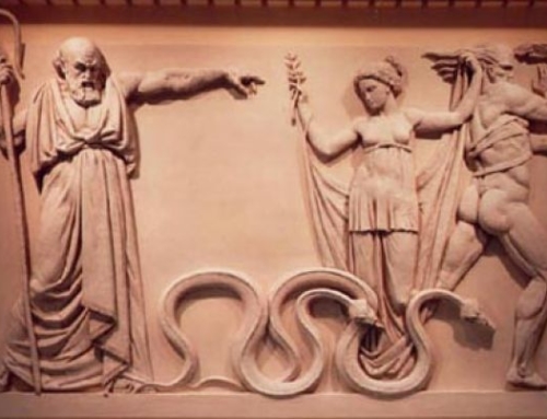
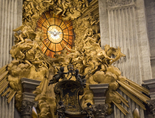
What many people forget about the liturgy is that what we see is more powerful than what we hear. We know that a visual image is more powerful than hearing, but we seem to forget that when we come to church. Because vision is more powerful than hearing it is important to make an effort to make the church–and especially the sanctuary of the church beautiful and inspiring.
What often happens, nowdays, however, is that beauty is the last thing the church designer thinks of. Utilitarianism rules. So the main concern is, “where will everyone sit?” or “where will we put the sound system?” or “Do we have the air conditioning vents in the best place?” The utilitarianism extends to other questions as well. I heard of one well meaning church designer who said, “The main aim in designing the church is that it is warm and welcoming.” They ended up with soft lighting, pastel color schemes, comfortable pews and cozyness. Others have said, “The main thing is that the altar is seen by everyone.” Other times images are placed in the church for utilitarian reasons or to obey some rubric or tradition or some earnest desire for a particular devotion without any sense of unity, beauty or design to the church. So the church will be designed solely with sight lines for the altar in mind, or it will be cluttered up with lots of inappropriate but worthy images.
Most often modern church buildings are designed by architects with no history of the tradition. They build functional, cheap buildings which are easy to maintain, comfortable and with a suitable heating and sound system. Then they make it ‘look like a church’ by adding fake arches with two by fours and plasterboard. They design a church with the same mentality as they design an Italian restaurant. “Let’s build a place for people to sit with a kitchen attached and then make it look like a Tuscan villa–Mexican restaurant? We’ll make it look like a hacienda. You want Indian? What about a mini Taj Mahal. It’s all fake and Disney-esque. They build the church with the same mentality–“We got a functional box for you here. You want Romanesque? We can do that. A few fiberglass pillars and some plasterboard and hey, you got Romanesque. You want Gothic? We’ll make the arches pointed.” Instead of real, integrity of design and beauty that is deep within the whole structure you get a cosmetic effect. It’s sort of the botox and facelift school of architecture.
Instead the church should be designed with the big picture in mind. The beauty of the architecture should start with the first drawings and the inspirational look of the church should be integral to the whole design and construction. In designing the church interior, you ask, where is the eye drawn when one enters the church? It should be to the altar and the tabernacle beyond. Anything that is distracting should be removed, and all images and furniture in their design, color and size should be secondary to the altar. There should also be a vertical ‘attitude’ to the design of the church. The heart should lift with height and spaciousness in the design. The design should also be hierarchical. That is to say, the ancient three fold pattern of the Jewish temple should be incorporated–a place for the people, a place for the sacrifice and a place beyond which is the Holy of Holies. This helps to draw the individual up and away from himself and the people around him and focus his mind and heart on God.
There is much more that can be said about the visual in church design and decoration, but another principal that should be stressed is that nothing in the liturgy should draw attention to itself and away from the altar and the action of the sacrifice of the Mass. Choirs up front as performers? Nix. Worship leaders and lectors up front as soloists? Nix. Choir music that is so wonderful (or so awful) that it draws attention to itself? No. Servers who are so wonderful (or awful) that they draw attention? No. Vestments or liturgical innovations that are ‘creative’ or ‘sincere’ but draw attention to themselves? No. The visual in church should be subtle, understated and traditional. Stuff that is modern and ‘clever’ draws attention to itself and is unworthy. Remember Ogden Nash’s dictum, “Here is a good rule of thumb: too clever is dumb.”
Some will complain that this puts everything in the hands of the aesthete. Good taste and the enjoyment of fine and costly things in church also has to be subject to the worship of the Lord. It is possible to go to the other extreme and make the church so fussy and pretty and to spend so much money on making it look good that the real purpose of it all is also lost. All should be done modestly, with good taste and expenditure of solid, mid range good quality stuff. Materials and workmanship that are cheap and shoddy do not give glory to God, but likewise, materials and workmanship that are inordinately expensive and luxurious cause scandal. It is bad to have cheap felt banners, polyester vestments and tin cups for chalices, but it is also a ridiculous scandal when you learn that a Poor Clare monastery has a tabernacle encrusted with diamonds.
Balance is beauty and beauty is balance.


Leave A Comment
You must be logged in to post a comment.